B2C App HomePage Redesign
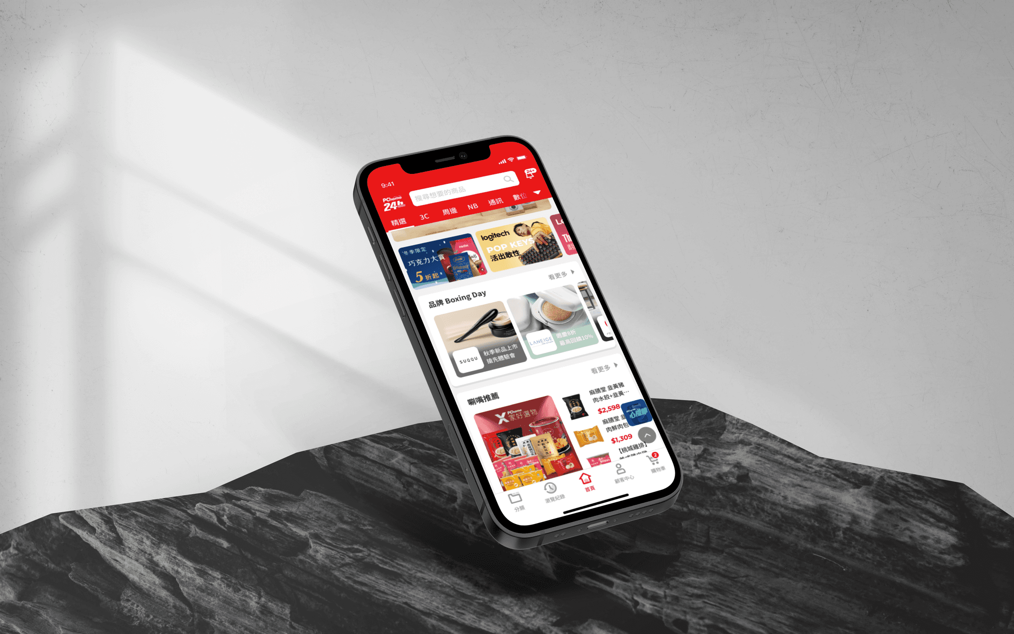
Our redesigned eCommerce app has increased engagement by 48%. With a sleek and intuitive interface, enhanced features, and seamless navigation, it redefines convenience and customer satisfaction. Get ready to embark on a transformative journey that combines style, functionality, and an unparalleled user experience.
Role
UI/UX Designer
Contributions
UI/UX Design
UXR
Project & Time
EC App
2 Month
Team
Researcher
Project Manager
Dev Team
Achievement
+47
%
Engage time
+23
%
Browsing Depth
+17
%
Conversion Rate
+56
%
By improving these metrics, the new homepage redesign can help to increase website traffic, boost sales, and improve the overall user experience. Gather more and more young users.
About this App
PChome24h is a major Taiwanese e-commerce platform known for its fast delivery options. It offer over 5 million products, with over 2 million in stock for immediate delivery. And boast 24-hour delivery throughout Taiwan and even offer 6-hour delivery in Taipei City.
Main Users
Background & Goal
PChome 24h aims to expand new business opportunities, including targeting younger users, capturing opportunities among female consumers, and increasing sales in various product categories. It requires the formulation of specific development strategies to establish PChome's image as trustworthy and reliable, creating a distinct advantage over competitors.
Start from User Interview
Research Purpose
Comparing the user experience of other competing e-commerce platforms, understanding the strengths and weaknesses of PChome's competition.
Exploring the usage experience, processes, and pain points of PChome 24h's target audience as references for the platform's redesign direction.
Research Progress
Balance Different Needs
Creating harmony between users and marketers is the real challenge. Finding a win-win scenario where users get smooth, personalized experiences that make their lives easier, while marketers grab attention and hit their business targets. The key is designing something that feels natural for users while helping the business shine.
Capture the Insight
1.
2.
3.
Wireframe & Prototype
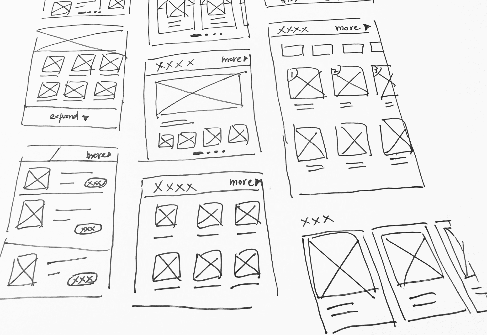
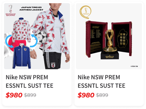
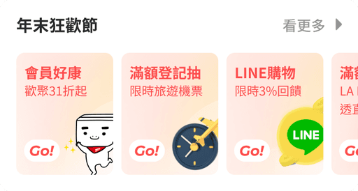
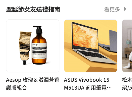
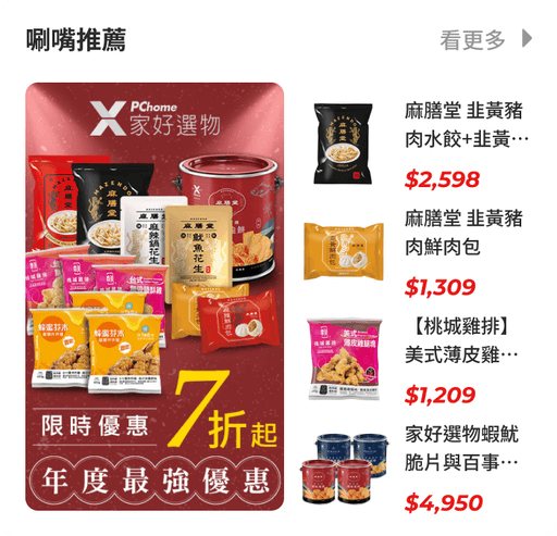
After figure out both need, also we considered the key to successful engagement nowadays is to combine breadth and depth in a way that makes sense, and in a manner consistent with the overall goal of the strategy. Here are some specific ways I put effort on:
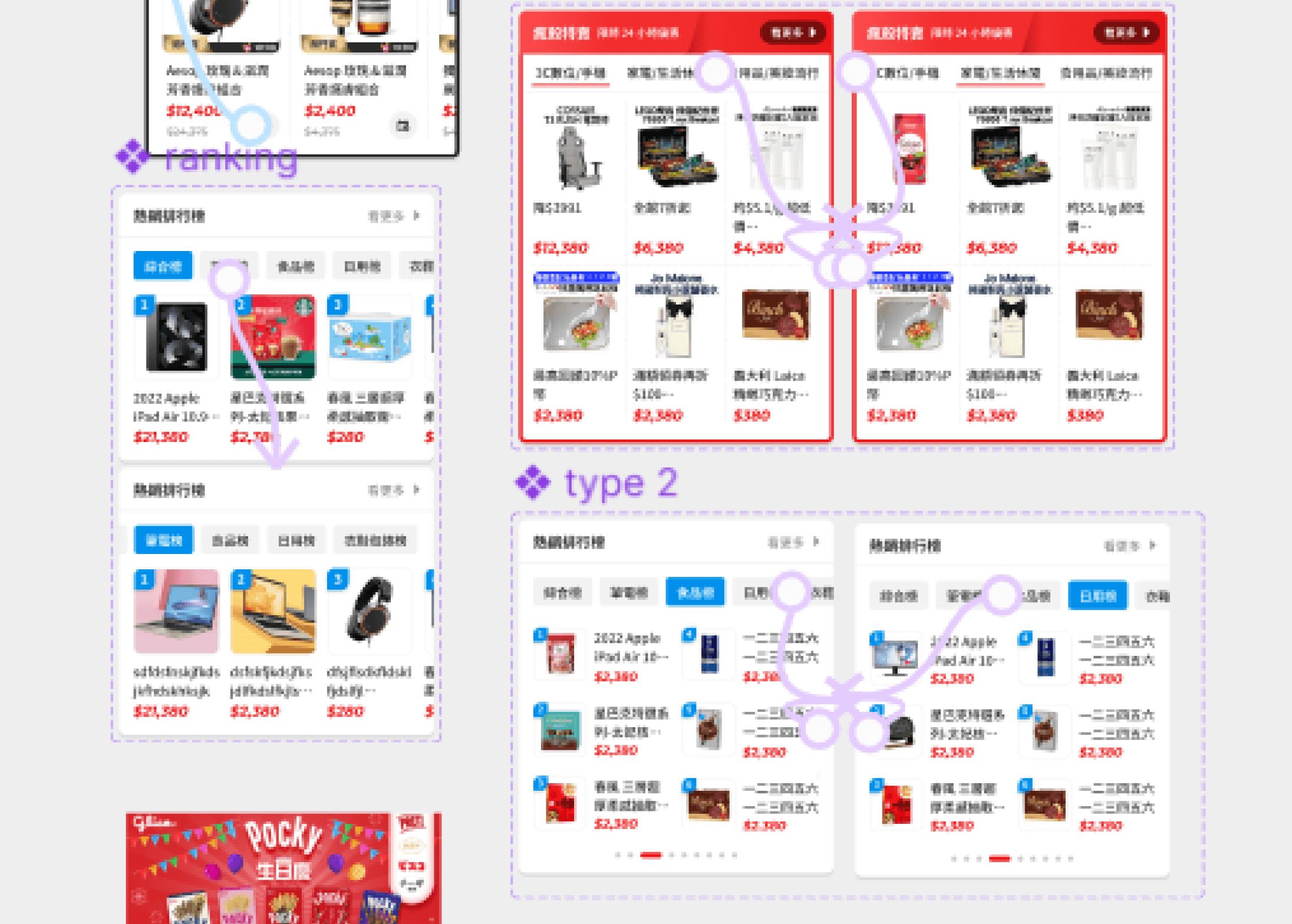
Components for depth strategy
marketing campaign
brand showroom
Video Area
Components for breadth strategy
Product Raking
Payment offer
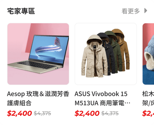
Specific Category
Showcasing diverse products to increase exposure rate.
Testing & Finding
Because we were making a e-commerce app, it would be better to full of ad like accurate situation, so I delivered a hi-fi prototype to test usability. Here are some major finding
User have to expand card if they want to check related product. It moves away next topic sale, it going to cause problem if the sale includes excessive products.
Tab & pagination show at the same time may confuse our user. They won’t know if they are browsing the products in category or they are moving up to next category.
Payment advertisement display in long scroll area better than page turning action.
Upon discovering the issues, I refined the design to address and rectify the identified problems.
Customizable Components
Details of all customizable decoration components. Arrange app's home screen by selecting and organizing components in the backend to suit marketing preferences.
Project learnings & Next steps
By combining collaborative efforts, data-driven decisions, and user-centric design principles, our team achieved a successful outcome that ultimately enhancing the app's performance and fostering a positive brand image. The project's post-launch insights will continue to guide future design endeavors, and continuous improvement for the app's success. After the redesign, There are still several actions can be taken to further enhance the app's performance and user experience:
User Feedback Collection: Continue to gather user feedback and conduct usability tests to gain insights into user satisfaction and identify areas for further improvement.
Social Proof: Highlight user reviews, ratings, and testimonials to build trust and credibility, influencing potential customers' purchase decisions.
Gamification Elements: Introduce gamification elements to enhance user engagement and loyalty through rewards, badges, and challenges.

