Design System & Guideline
The implementation of repeating elements throughout the website has enabled the achievement of a consistent visual aesthetic, thereby ensuring a uniform user experience for all consumers across the site.
Role
UI/UX Designer
Contributions
UI/UX Design
Project & Time
Design System
Non Stop
Team
Dev Team

Why building design System?
This documentation gives us the ability to visualize the entire process, identify areas for improvement, and streamline specific parts through constant re-usage and refinement.
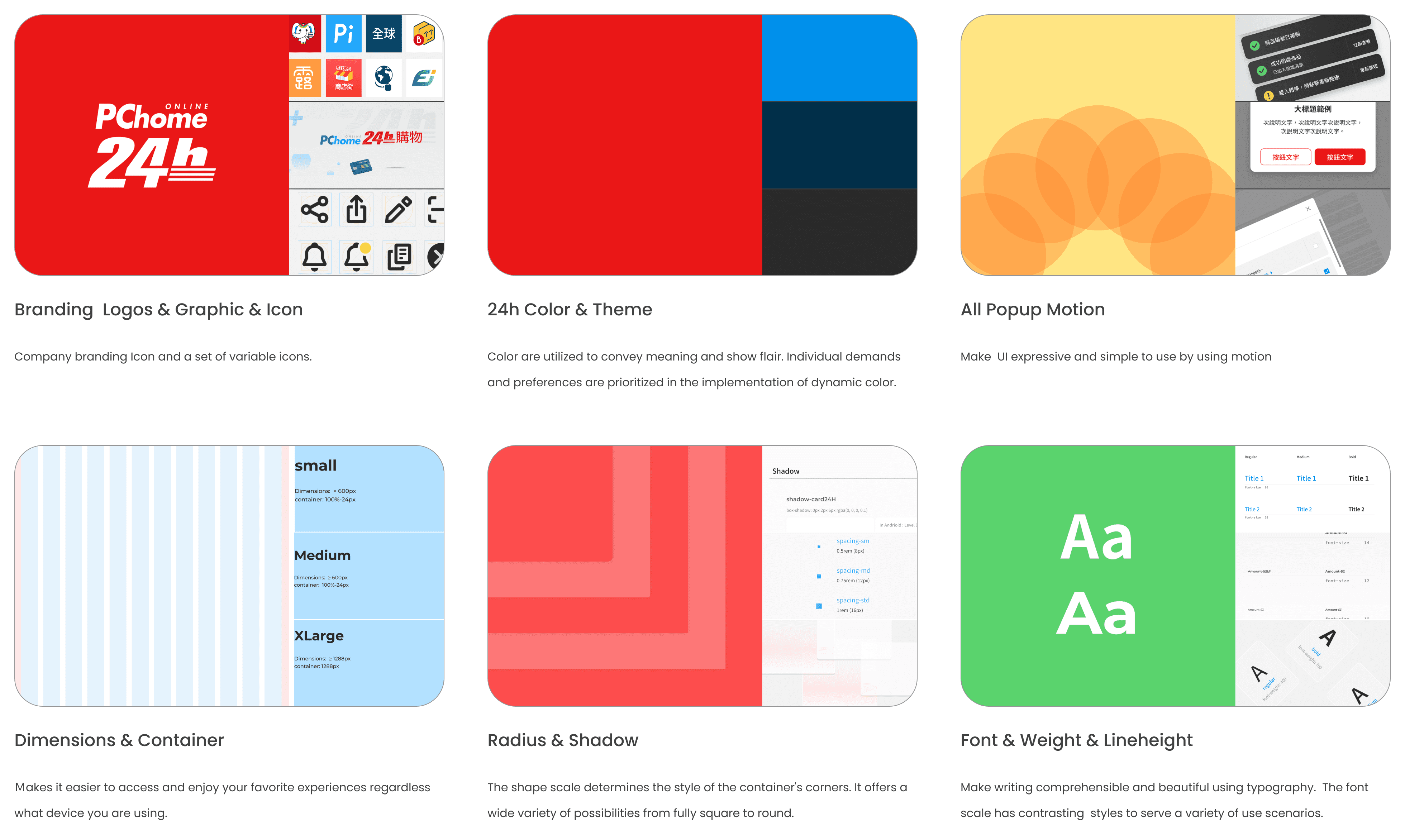
Foundation.
Foundations inform the basis of the user interface, from accessibility standards to essential patterns for layout and interaction. Style like color, typography, and shapes are contained within the design system.
Save time!
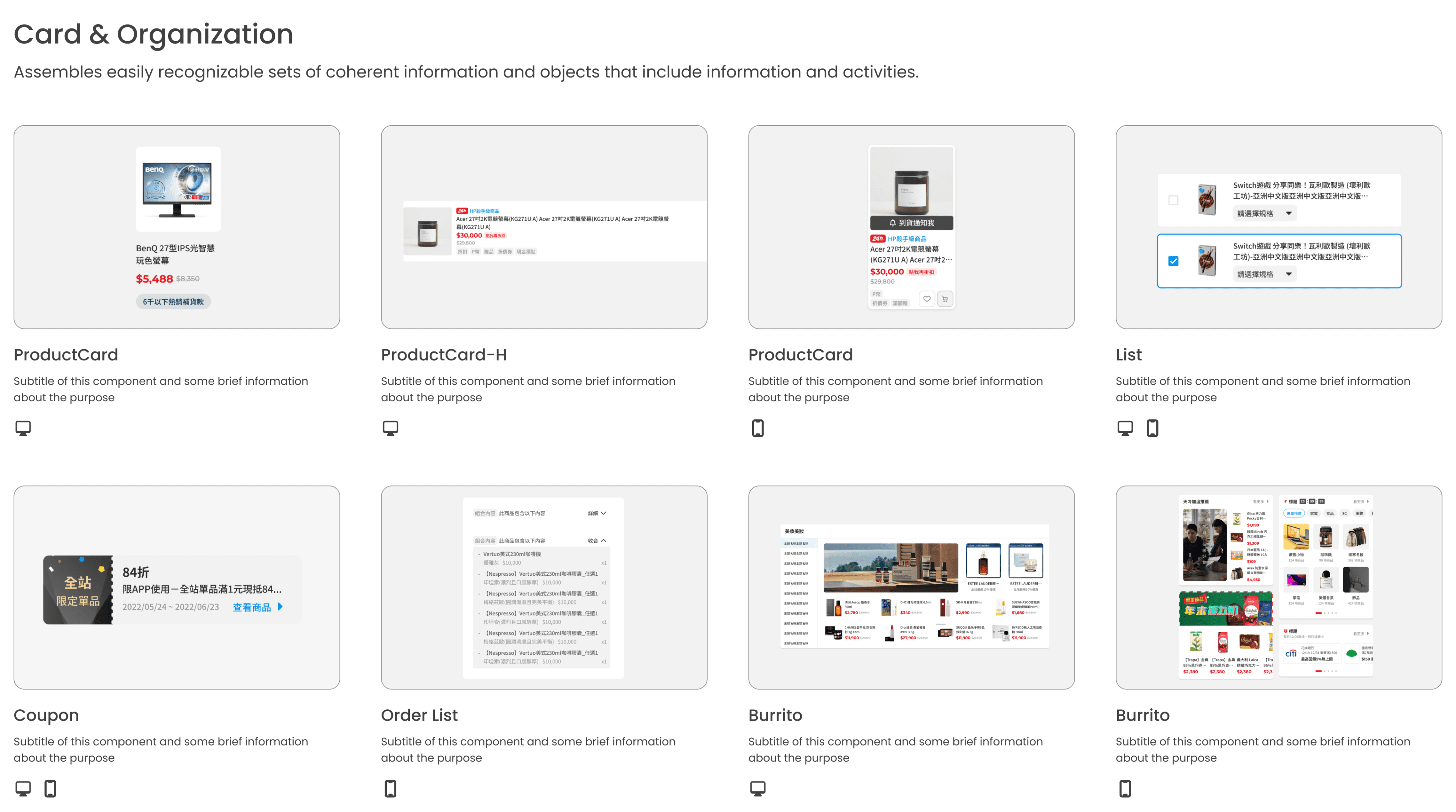
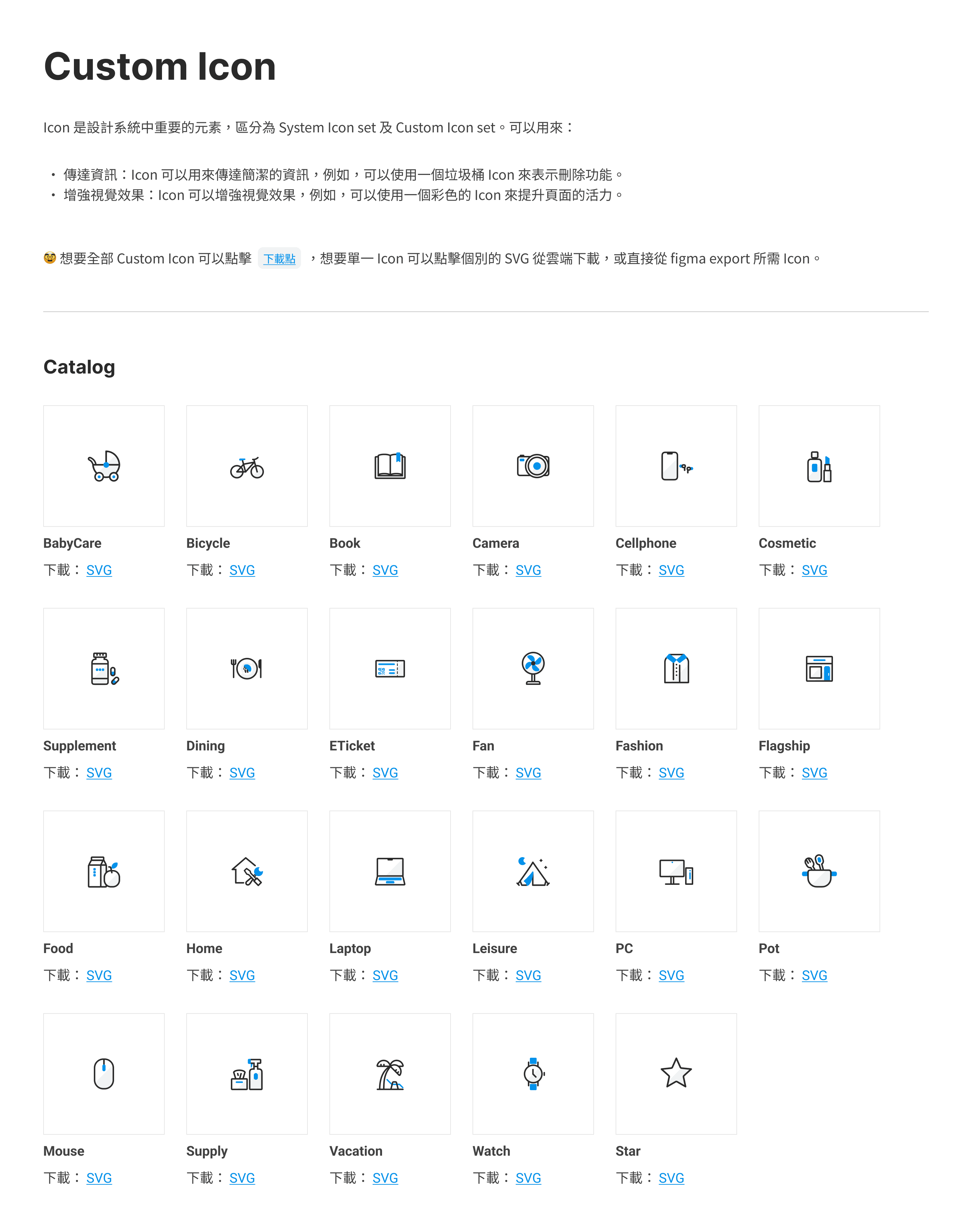
Split our website into 200+ Components & 30+ Categories for better consistency, less technical debt, and faster updates.
Foundations & Style
Component
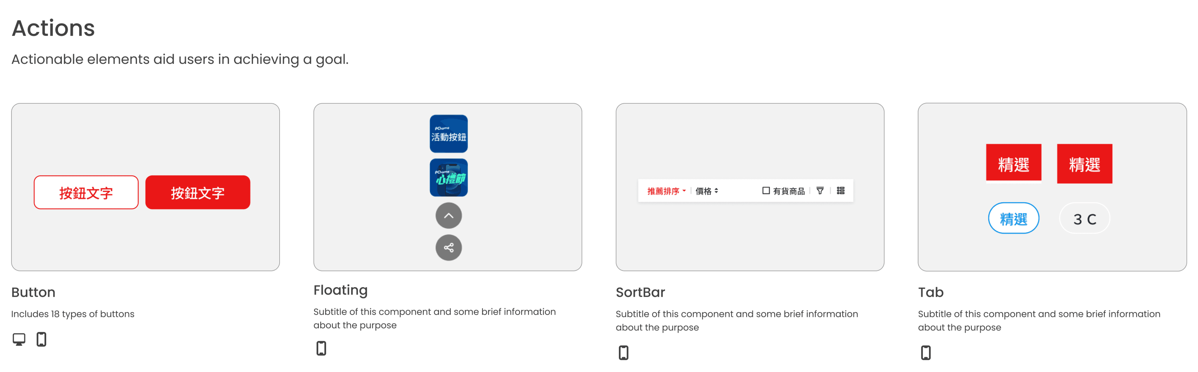
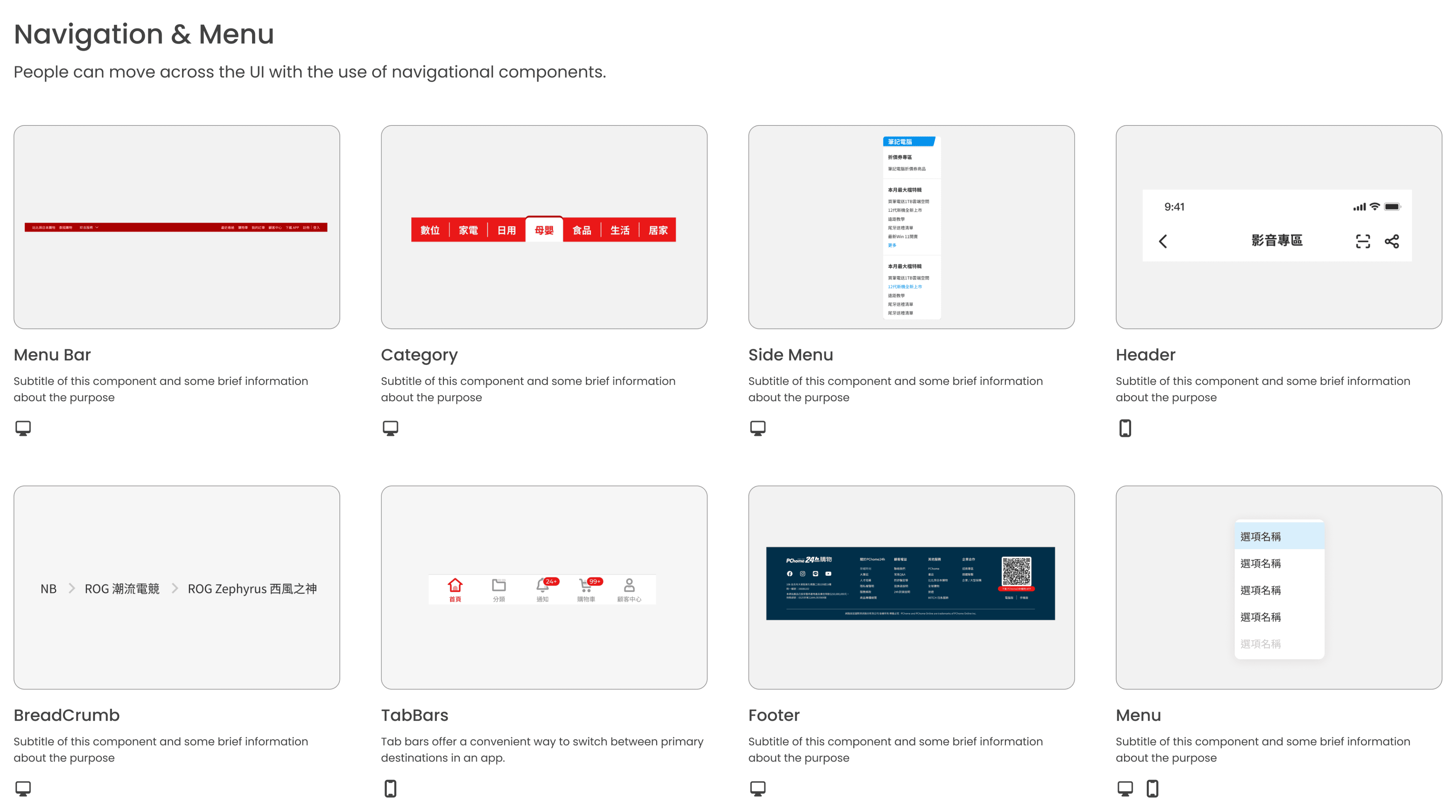
What Includes ?
Website foundation with customizable color, typography, and elevation styles
40+ frames with component and style guide documentation
200+ Components & 30+ Categories with figma variants and auto layout
Component Usage, anatomy, behavior.


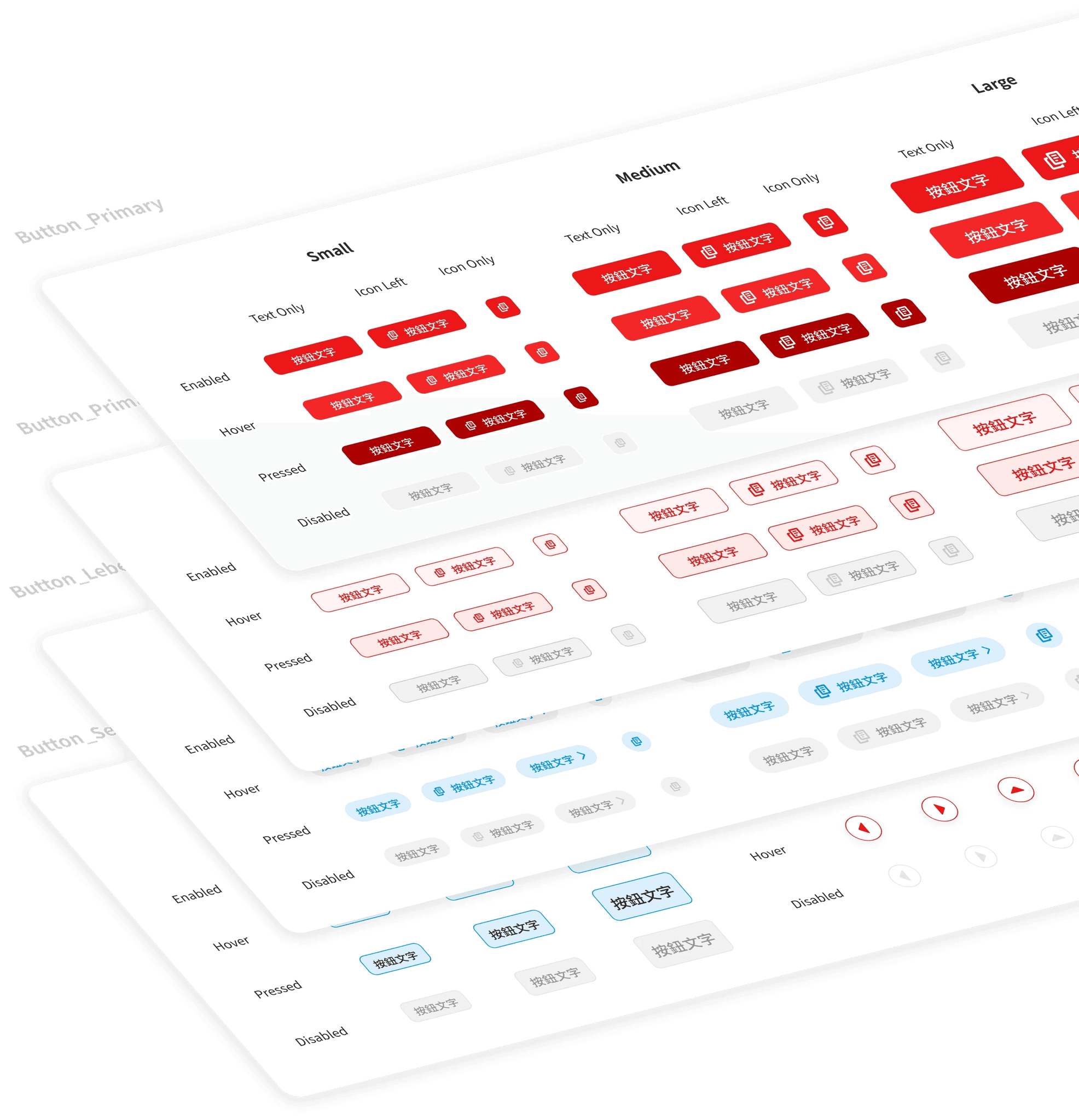
Button
Input


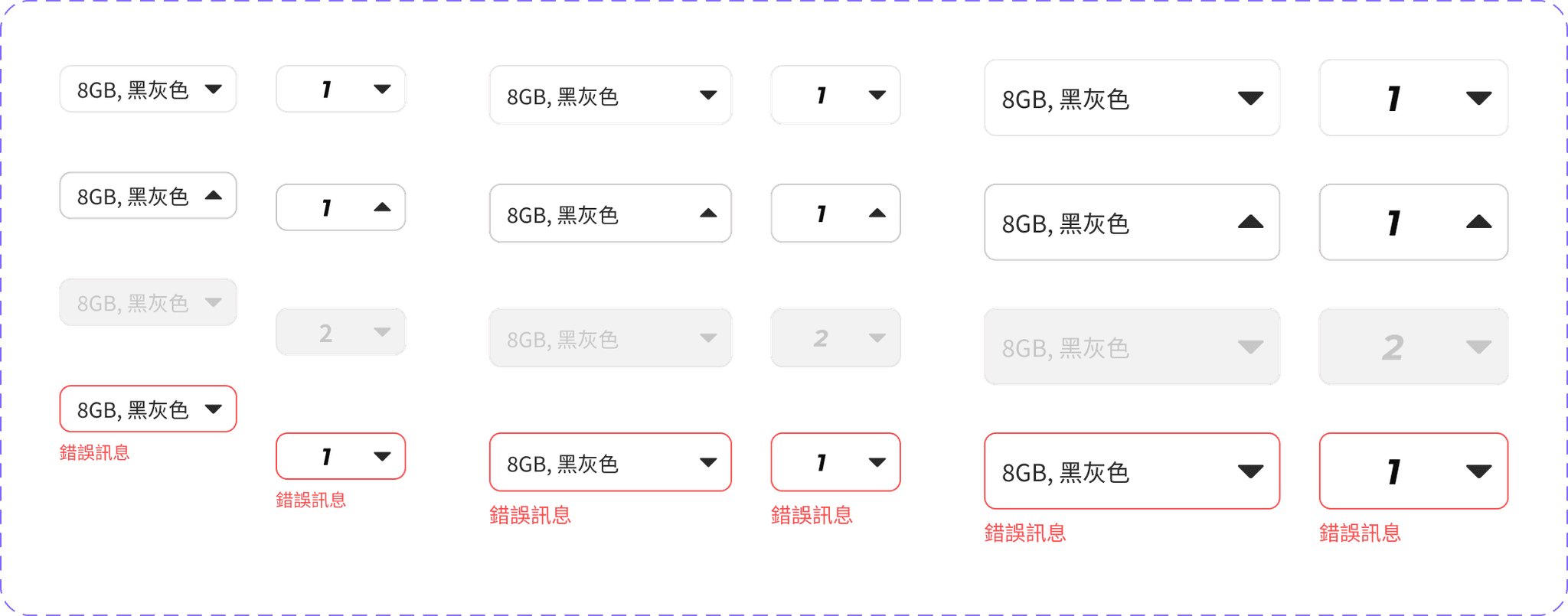
Dropdown
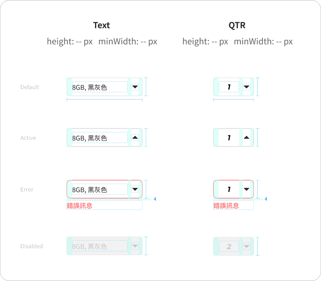
Large
QTR
Text
Medium
Text
A
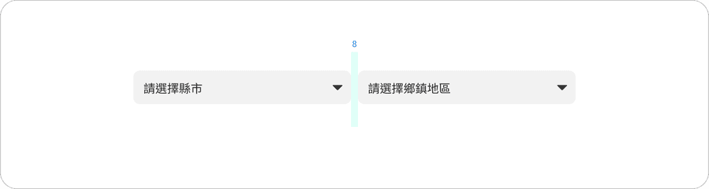
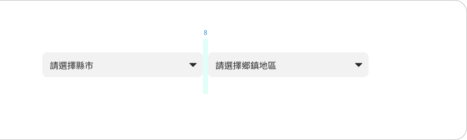
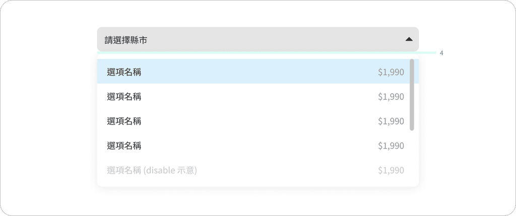
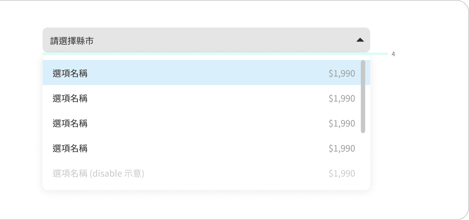
Dropdown *2
B
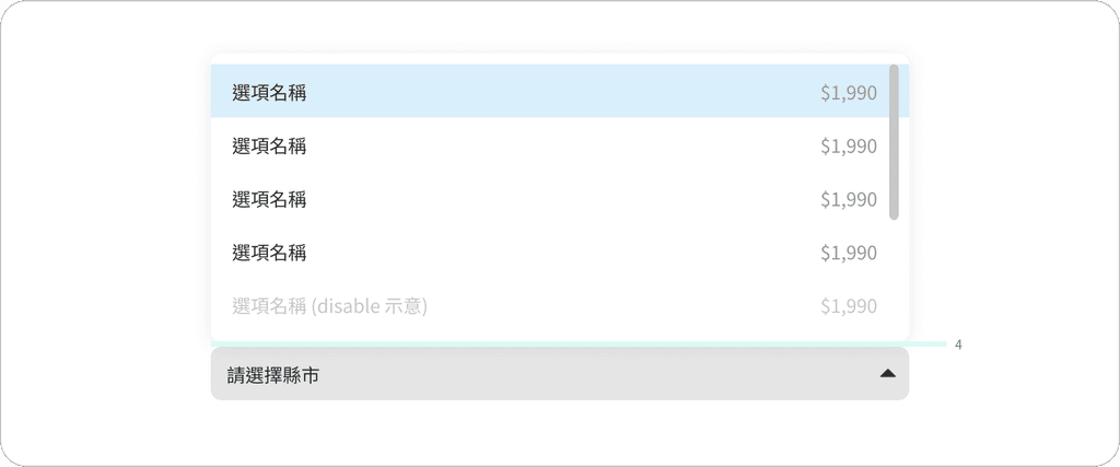
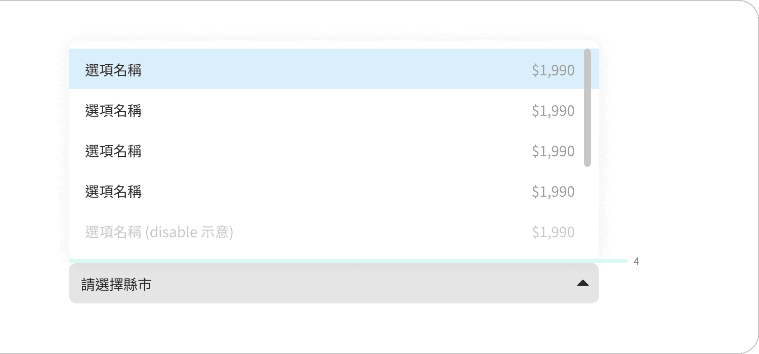
Dropdown Open Menu
Checkbox

Radio Button

What is inside the Component Guideline?

Usage
Outline when and how to implement it effectively. This section provides context, scenarios, and best practices to ensure consistent and appropriate application across the design system.
Anatomy.
Breakdown component's structure, identifying core and optional elements. It illustrates the visual hierarchy and relationships between parts, helping designers and developers understand composition.
Property
Properties define the customizable attributes of a component. Lists available properties, explains their impact on appearance and functionality, and provides guidance on appropriate values and combinations.
Behavior
Details how a component responds to user interactions. It covers state changes, animations, and transitions, ensuring a consistent and intuitive user experience across the design system.