InJoy Living : Book Tickets For Daily Experience

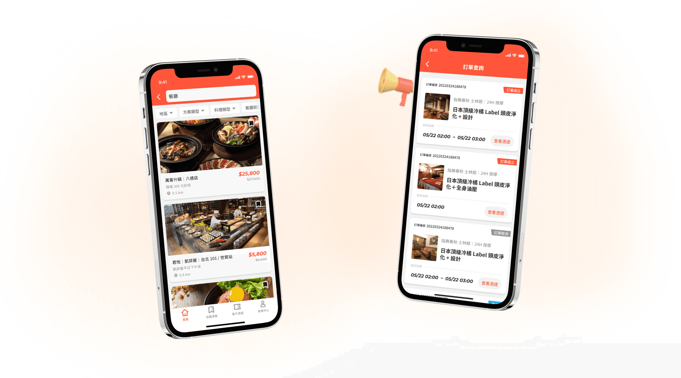
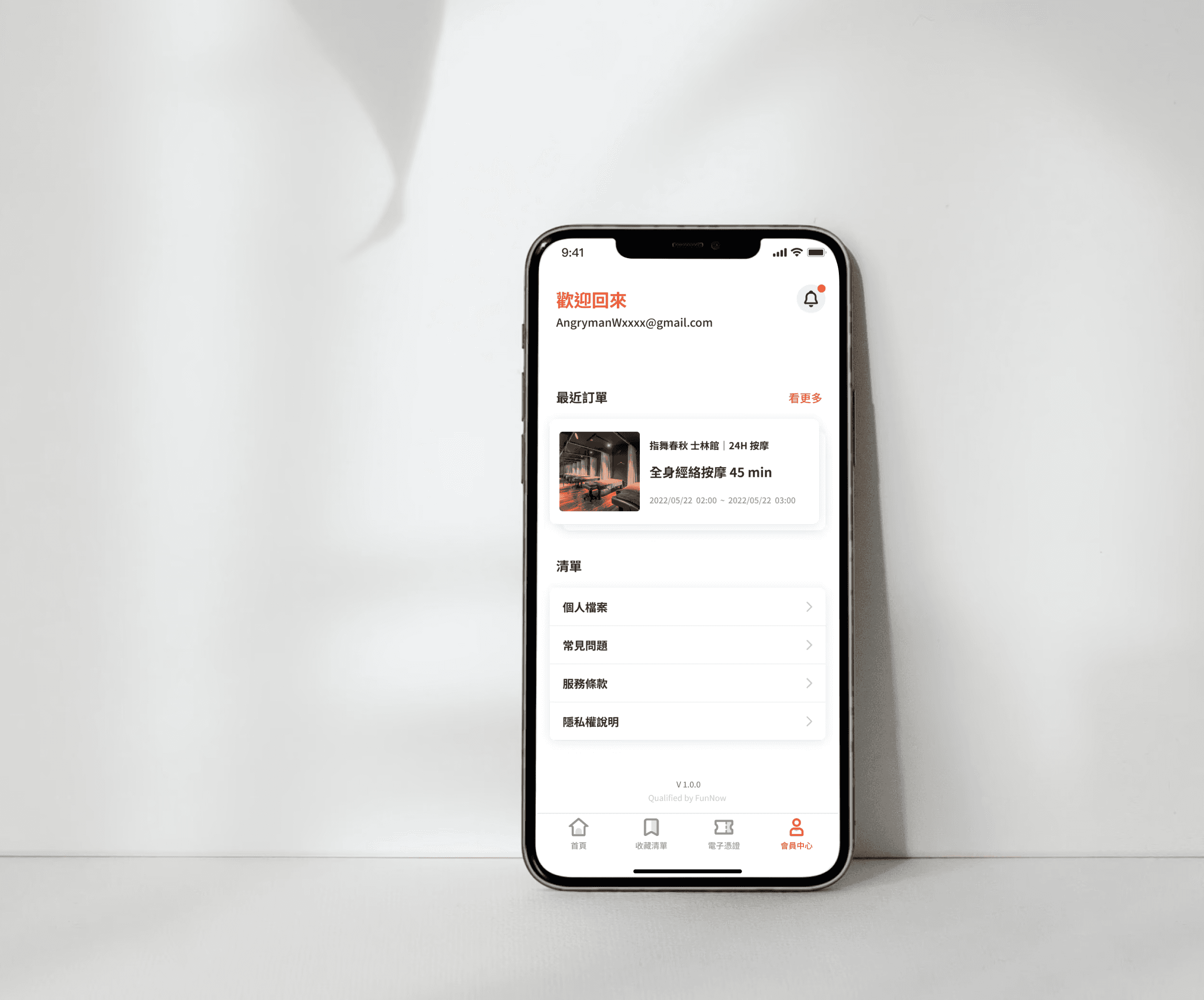
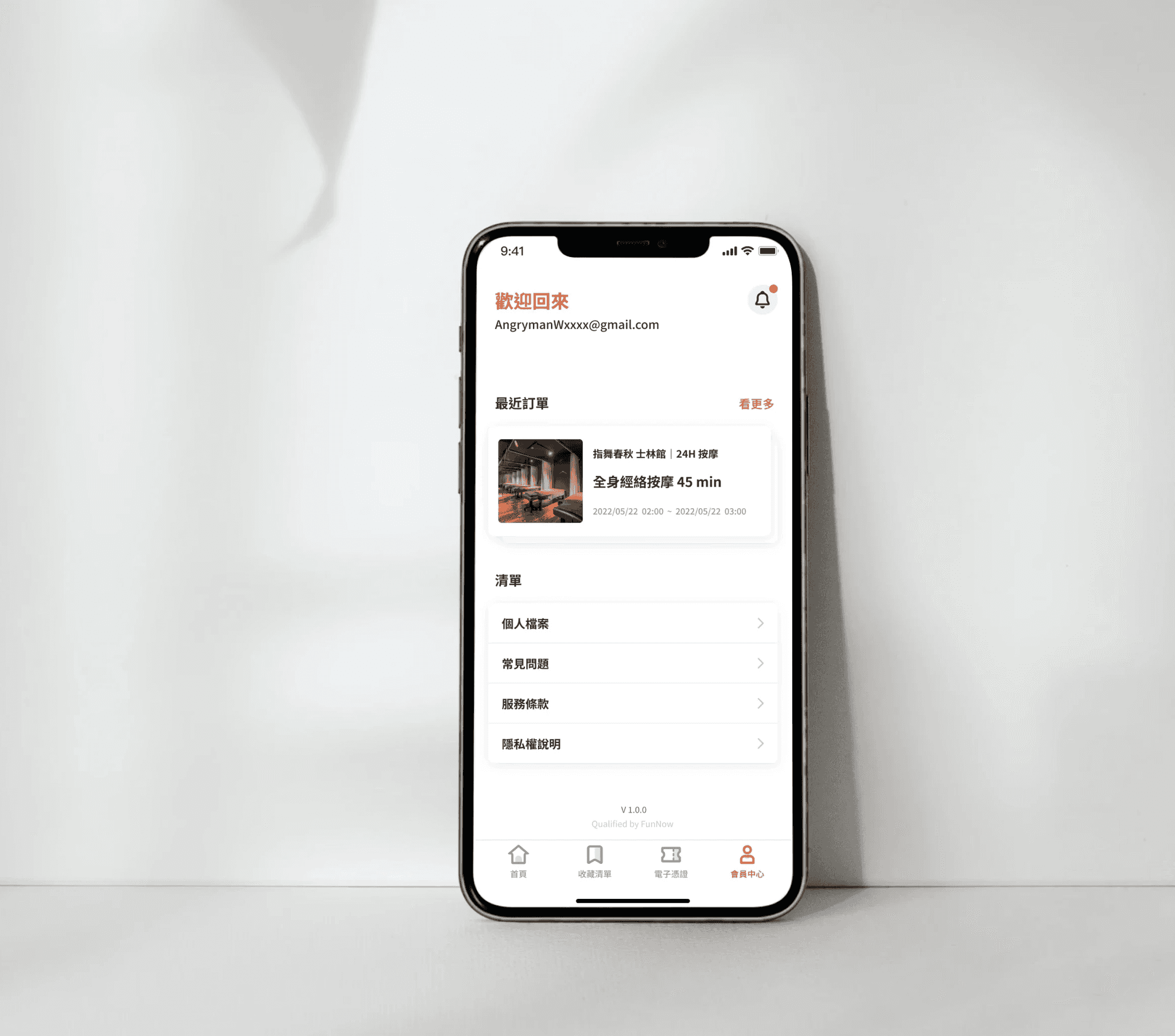
A voucher App for leisure experience voucher purchase service adopting InApp Micro Service inside the original app. The overall design principle is to stay consistent with the original app's design style and reduce visual discrepancies for users when switching between services.

Role

UI/UX Designer

Contributions

UI/UX Design

UXR

Project & Time

EC App

1 Month

Team

Project Manager

Dev Team

Project Goal

Allowing users to quickly search for nearby entertainment or restaurant services, and purchase experience tickets or vouchers that can be used immediately.

Allowing users to quickly search for nearby entertainment or restaurant services, and purchase experience tickets or vouchers that can be used immediately.

Allowing users to quickly search for nearby entertainment or restaurant services, and purchase experience tickets or vouchers that can be used immediately.

Competitor Analysis

Conducting competitor analysis during the design process provides invaluable insights into industry trends, user preferences, and potential gaps in the market. By studying competitors' strengths and weaknesses, designers can refine their product strategy, identify areas for innovation, and ultimately create a more competitive and user-centric solution.

Key Takeaways
  1. Focuses on unique local experiences
  1. Focuses on unique local experiences

  1. Integration with local payment gateways
  1. Integration with local payment gateways

  1. Colorful interface with easy-to-use layout with intuitive navigation
  1. Colorful interface with easy-to-use layout with intuitive navigation

SETTING UP STRUCTURE

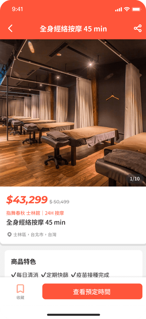
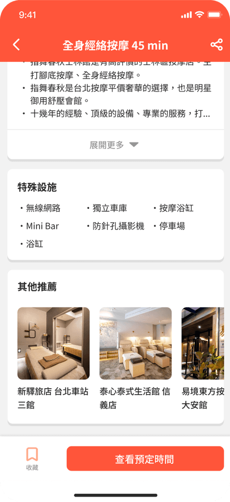
We developed the voucher app concept based on user research findings aligned with our business objectives. Through multiple iterations of wireframing and prototyping, we refined the app's core features. I created a streamlined user interface that prioritized voucher discovery, personalized deals based on user preferences and location, and effortless redemption processes.

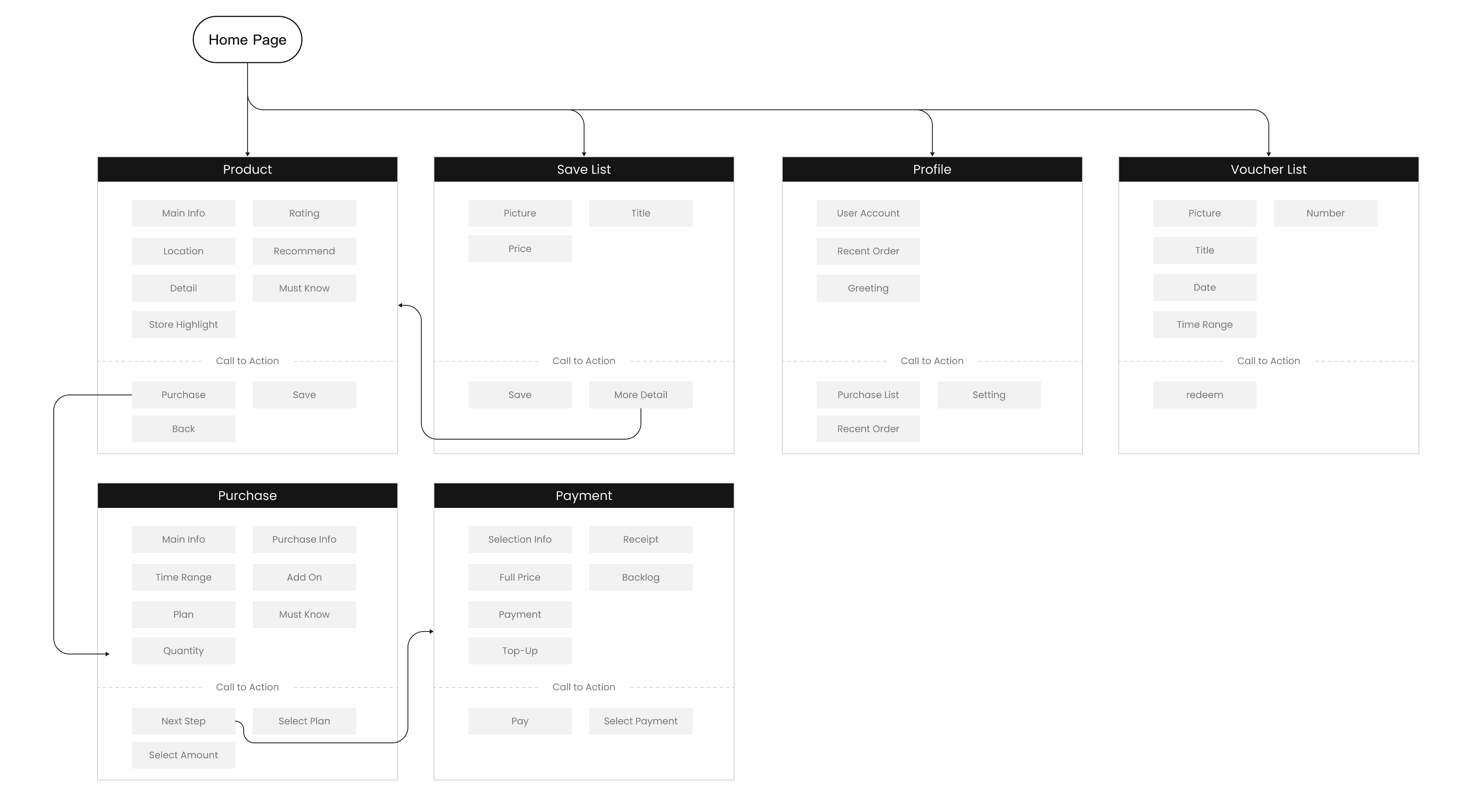
Wireframe

Final Design

In several iteration, the key functionalities of the product were explored and the behavior defined while a small development team built the first proof of concept.

In several iteration, the key functionalities of the product were explored and the behavior defined while a small development team built the first proof of concept.

In several iteration, the key functionalities of the product were explored and the behavior defined while a small development team built the first proof of concept.

01

01

01

01

01

01

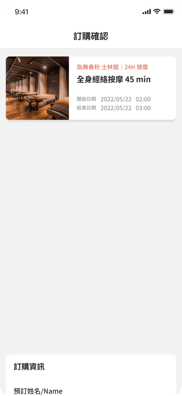
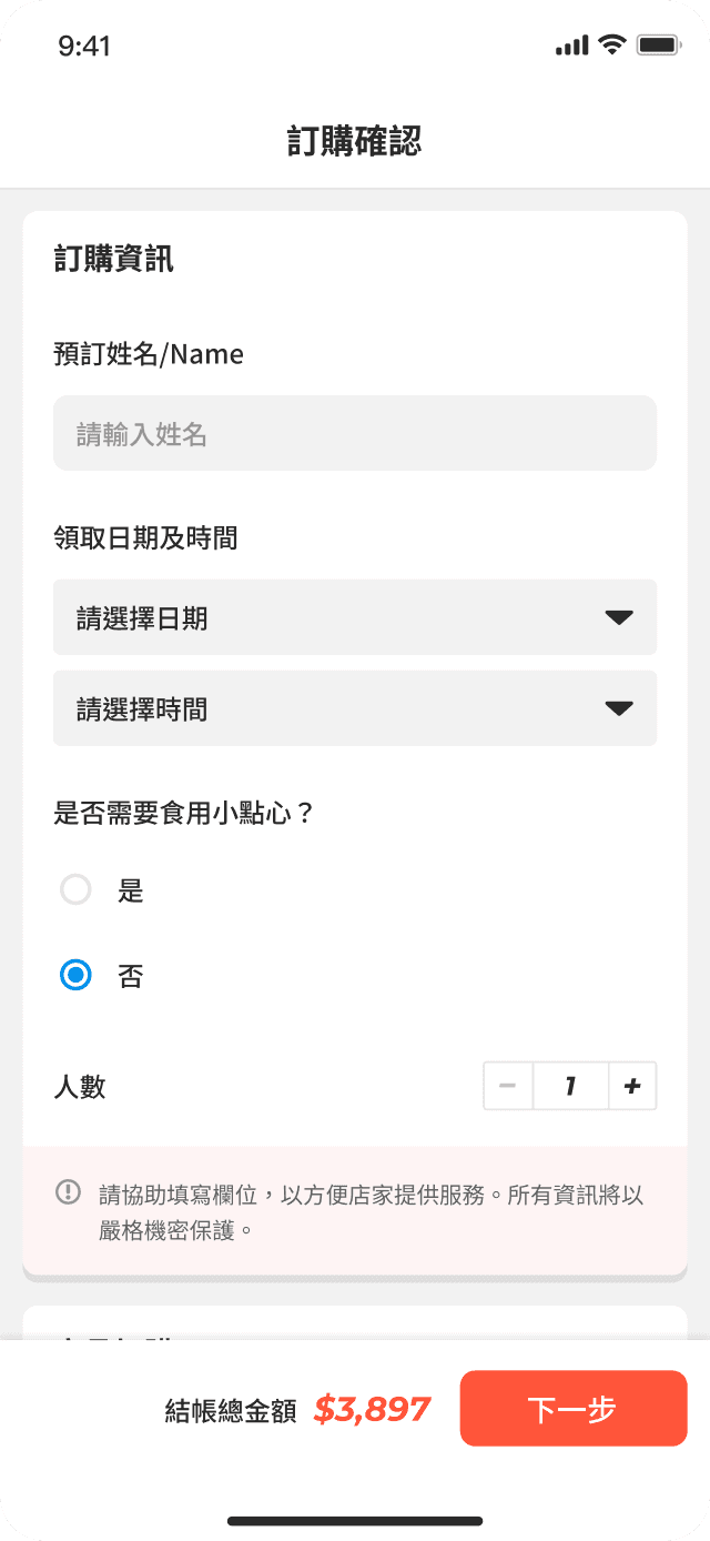
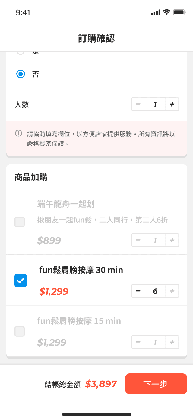
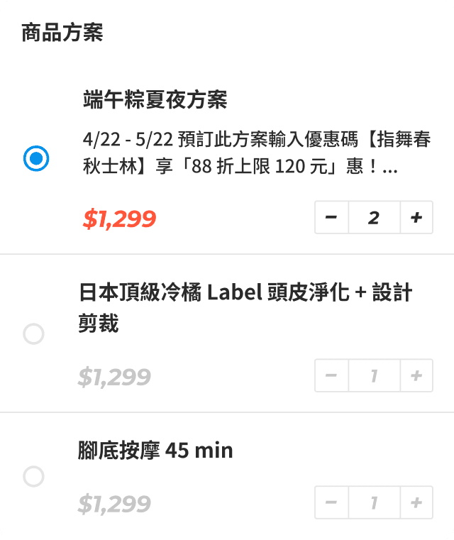
Product Selection

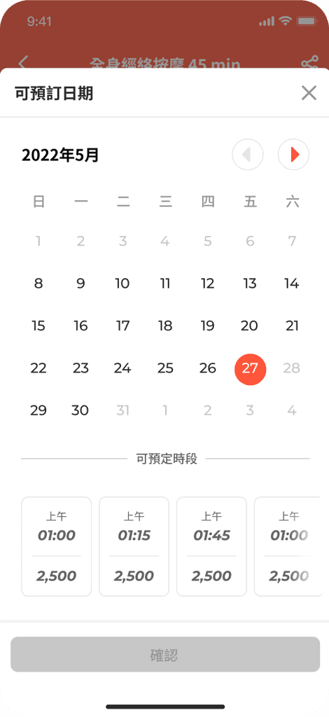
One-page intuitive selection process that making it simple for users to operate their preferred option. The process unifies product add-on operations and includes mechanisms to prevent errors.

01

Product Selection

One-page intuitive selection process that making it simple for users to operate their preferred option. The process unifies product add-on operations and includes mechanisms to prevent errors.

02

02

02

02

02

02

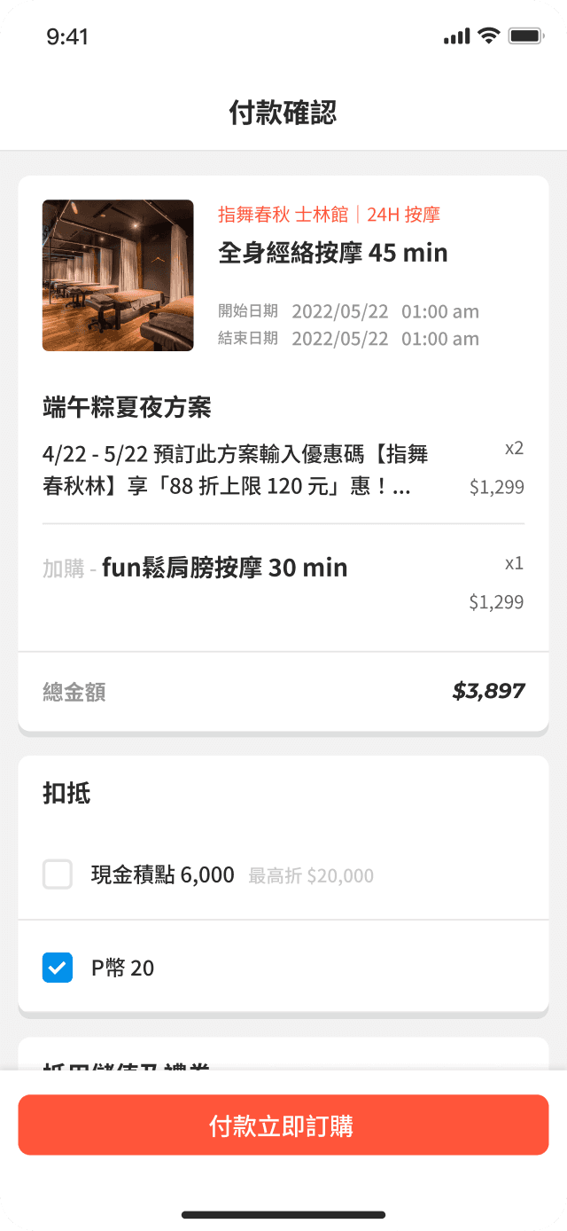
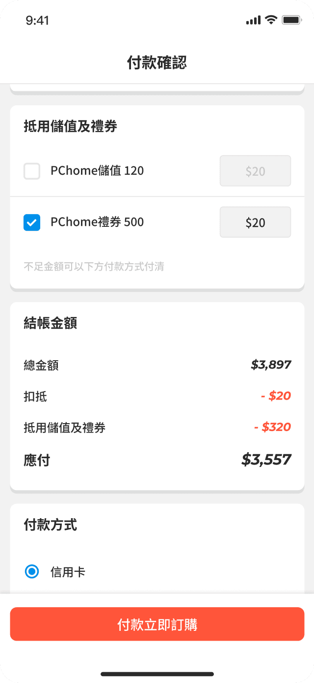
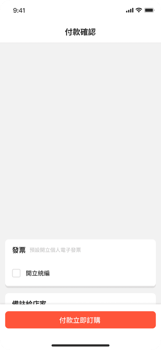
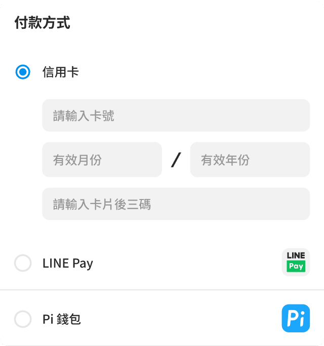
Checkout Process

Amount and discount are clearly displayed in contrasting combination of the main color and black. Users are prompted to enter applicable discounts or vouchers in a specific order, and also to choose a payment. The invoice information and any remarks is located at the end of the checkout process.

03

03

03

03

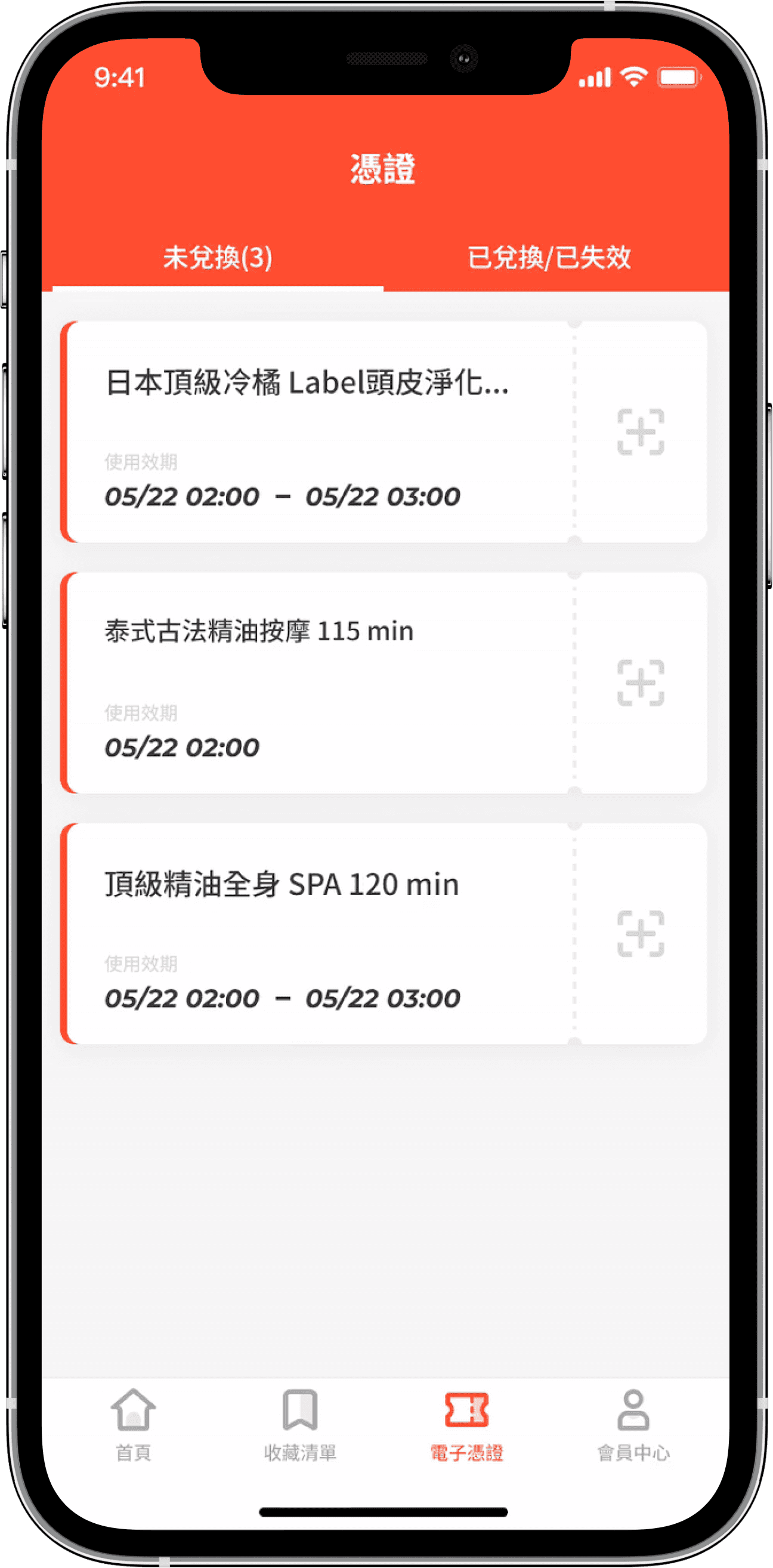
Utilize

The tickets page clearly distinguishes between available and expired certificates. As the main user group is young customers, lively and dynamic designs are used for certificate operations and interactions. The visual hierarchy design places the visual focus in the center, which also facilitates offline operations for merchants.

The tickets page clearly distinguishes between available and expired certificates. As the main user group is young customers, lively and dynamic designs are used for certificate operations and interactions. The visual hierarchy design places the visual focus in the center, which also facilitates offline operations for merchants.

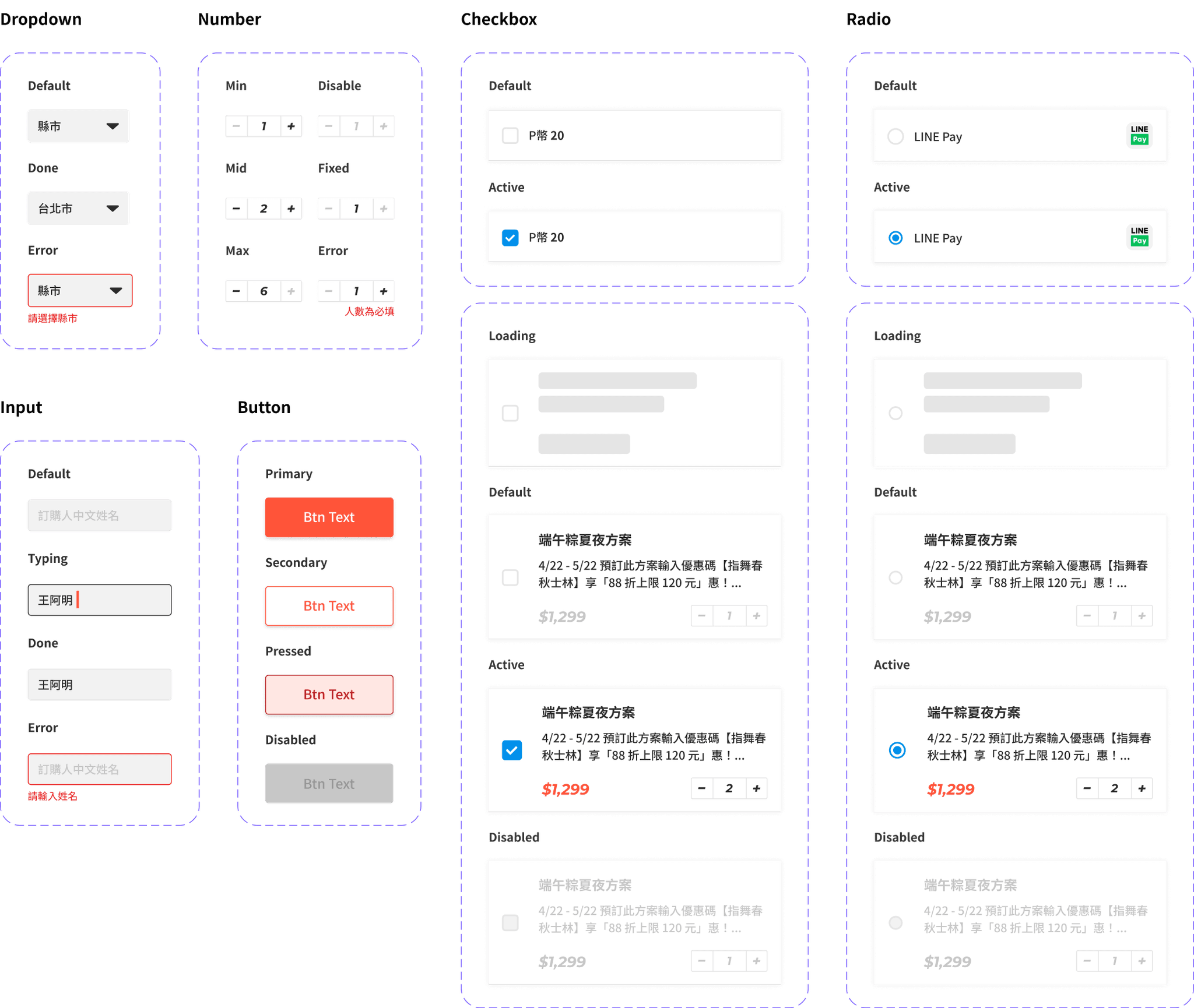
Design Guideline

The color scheme of the app is revamped to optimize screen color contrast. The font size hierarchy is refined for improved clarity and readability, The Guideline define the whole style and basic layout .

#FF553A

Noto Sans

Noto Sans

Information

Montserrat

Montserrat

For $Price

#FF553A

#FF553A

#FF553A

Book Tickets For Daily Experience

Book Tickets For Daily Experience

< Previous

Book Tickets For Daily Experience

©Copyright 2023 Lazine. All rights reserved.

©Copyright 2023 Lazine. All rights reserved.

©Copyright 2023 Lazine. All rights reserved.

©Copyright 2023 Lazine. All rights reserved.